PostUp
The PostUp app was developed by using a modified Google Design sprint prompt by BiteSize UX and Springboard.
My role in this Post Up design sprint project was the sole designer on this one-person design sprint.
Go to the prototype here
Discovery
The Company:
PostUp is a startup that helps remote workers be as successful as they can be by sharing tips and connecting workers to each other. PostUp noticed a lot of their user’s sharing public locations where workers can go to do their work remotely and wanted to roll out a feature that would help their user’s find these optimal public work locations.
What did we know?
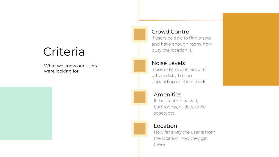
Insights from their research show that their users may look for amenities, noise nevels, crowd levels and atmosphere (are other people working there or not?) when choosing a public location. The amenities they look for are Wifi, bathroom’s, outlets, table space, and coffee and food services. Location and proximity is also important to users. User’s want to know if they would be able to take a phone call there without disrupting others and if they could hold meetings at this location. They also would like to know if they would be allowed to work there all day without being disturbed and if they need to purchase something in order to use the wifi and take up a table.
USER PERSONA
Our user persona is Nina, a 32 year old freelance copywriter who lives in Boston. She needs to be able to find a place to work quickly that has the features she wants.
More insights from a user interview are that libraries can be too quiet, so coffee shops are usually the next best thing. Distance is important, they would usually look on a map to see where they could get to quickly and easily. They wanted more information past busy times, like if chairs and tables would be available and wanted more photos of the interiors to get a feel for the space. Like the insights from our other user research, amenities like wifi, outlets, and bathrooms were very important but are things that are not always included in reviews that traditionally would talk only about the food and service.
SOLUTION
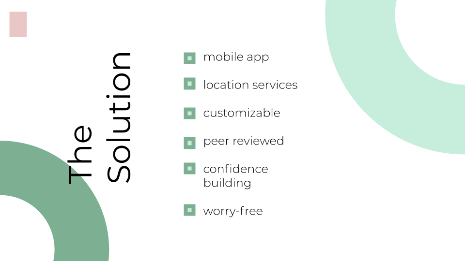
Our solution was to create a user experience where user’s could find public places to work remotely and filter by their preferences. I wanted to be able to cater to every kind of person’s working style and include filters from the very broad (indoor or outdoor?) to most detailed (what’s the atmosphere like? Will I be able to find outlets to use?) so all our users had to worry about was what was on their agenda for their day and could be confident walking into the place of their choosing. I set out to create a tool that did just that but still had a few questions to answer in order to guide the rest of the sprint.
I wanted to know:
Hmw help users discover places to work around them?
Hmw instill confidence in our user’s that they will be successful working there?
Hmw help users quickly find and choose a place that would be right for them?
IDEATION
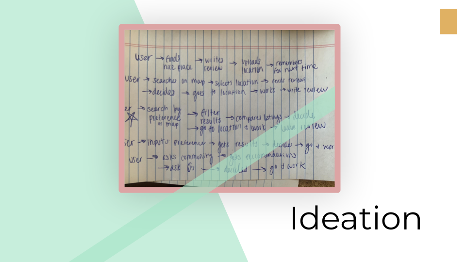
I started drawing out maps a user could potentially take in order to ultimately end up with our end goal: them finding the perfect place to take their work for the day.
I toyed with many ideas, like:
crowdsourcing ideas from an online community,
a social network like platform where people could review and share the places they found with others,
a modified map application that would bring up remote-working friendly locations
Ultimately, I settled with a product that would give my users the most flexibility, help with their discovery and allow them to connect with others all at the same time.
SOLUTION
The key features of such a delightful product would have to include:
Fast and easy discoverability
Customizable search results
A fabulous map and location tracking
The ability to read and write reviews
The nitty-gritty information on restaurants, coffee shops, etc. that you couldn’t find anywhere else.
Once I properly understood the problem space, our user’s needs and knew what it was going to make my solution successful, it was time to really bring it to life and I was ready for the challenge.
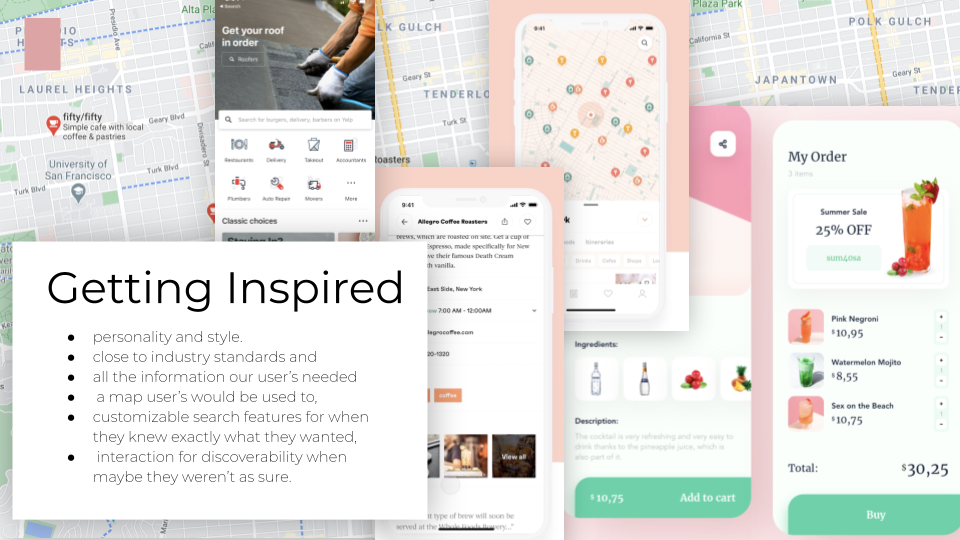
To start dreaming up such a product, I looked to existing apps with great interactions and experiences to inform my own decision making and designs. I looked at examples as seen above like Yelp’s information hierarchy, Google map’s interactions and display and a variety of designers and projects on Dribbble and Behance for visual design inspiration.
I wanted a clean, easy to use product that had
a little personality and style.
as intuitive as close to industry standards and
all the information our user’s needed to be easily accessible.
Additionally, I needed
a map user’s would be used to,
customizable search features for when they knew exactly what they wanted,
And a cool, fun interaction for discoverability when maybe they weren’t as sure.
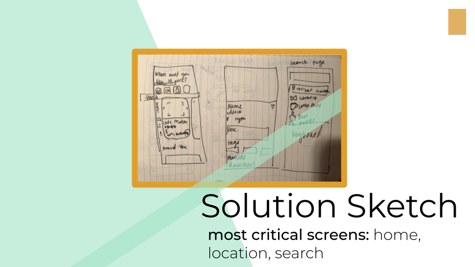
Solution Sketch:
My most critical screens for this would be the home page for discoverability, the location page (most critical) to display the information that the users really want to know, and the search function.
The finding and the choosing was what I really wanted to focus on, and even though there were many potential ways to support those actions, I knew I had to get those screens exactly right for the best user experience.
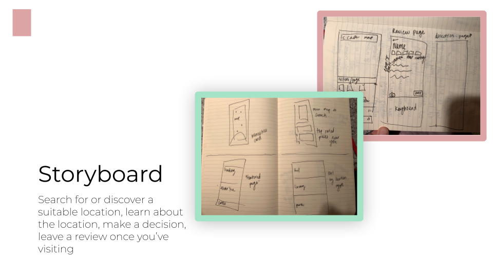
Storyboard:
From my most critical pages, I was able to flesh it out a little further. I could start imagining how the rest of the app would look and operate, and piece it together so it would behave intuitively and all the actions in the app would work together. I saw how the user would actually interact with a product like this and feeling confident in my solution, I was able to start prototyping it and take it off the page.
Prototype
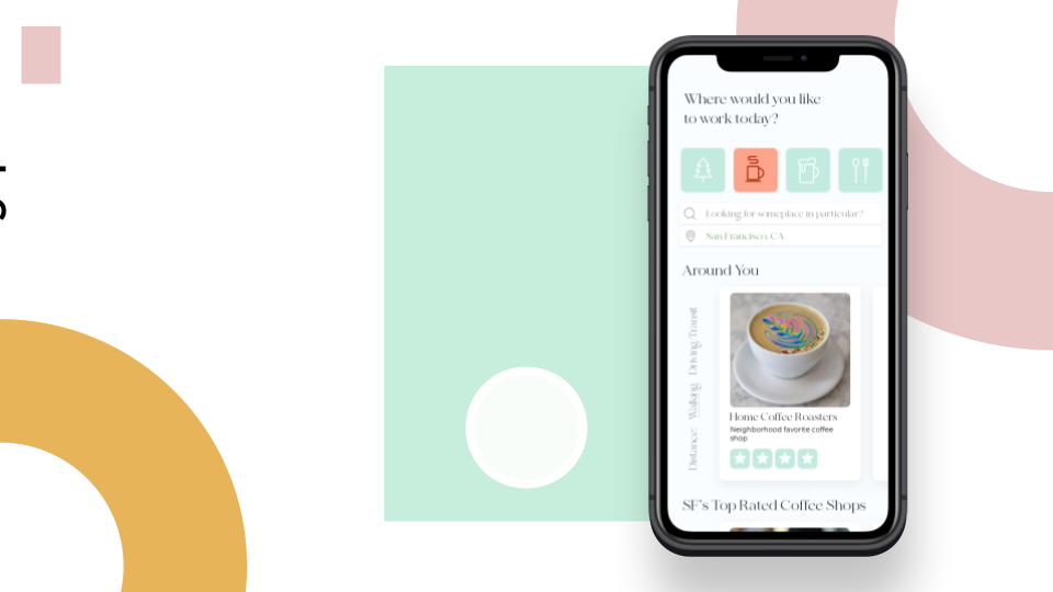
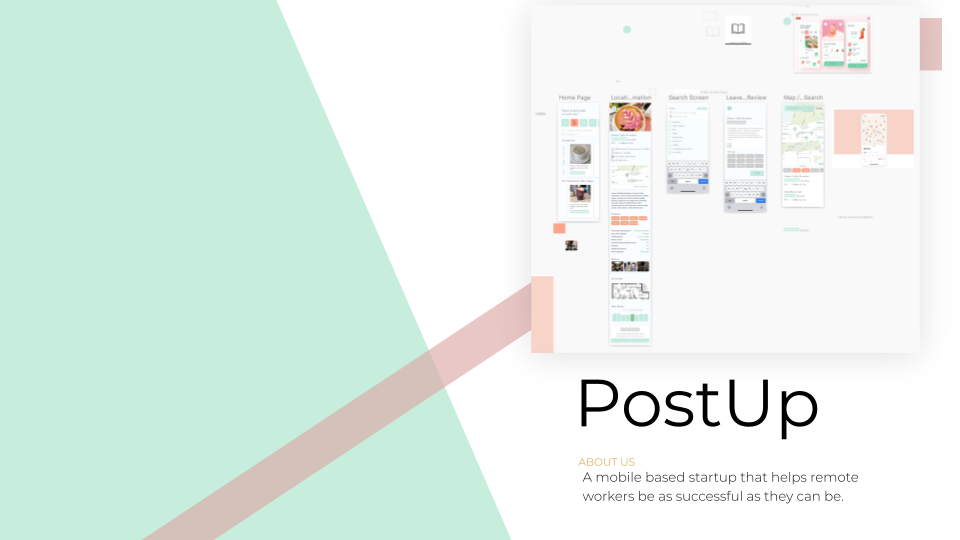
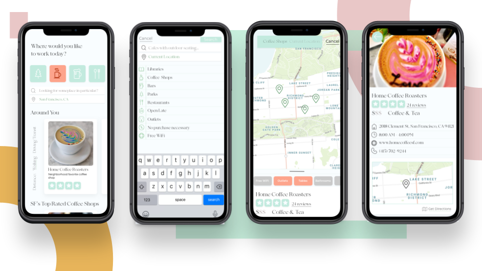
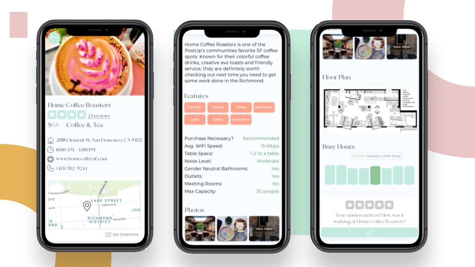
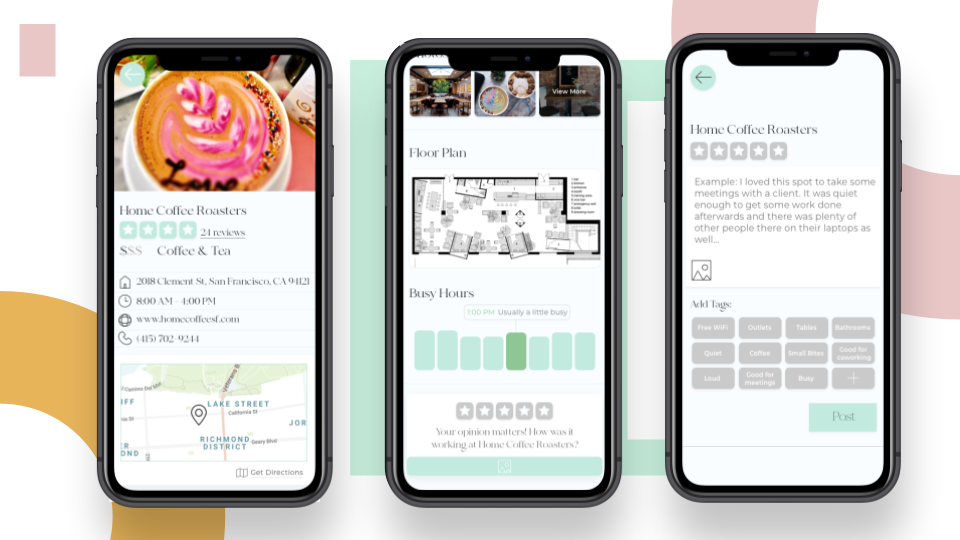
Knowing what I wanted to build, I started putting it all together. I wanted to create a really intuitive, beautiful landing page for users to scroll through. The landing page lets user’s filter by location type, distance and see location at a glance with their average review and a brief description. If one of these cards catches their eye, they can select it and review the location in more detail. The location information page contains information catered to the remote worker, since we learned from our research that the worker needs much more specific information that the regular customer who was mostly concerned with food, price, and service. Our users are presented with the location, contact information, floor plans, busy hours, and work atmosphere among other details. Users also have the options to search for a place directly, using featured prompts or by location on the map. We made it really easy to write a great review to empower user’s to use that feature and help us and each other learn more about what makes a truly great working environment.
Search and Map
Learn
Leaving a Review
TESTING
I finished off this design sprint by putting my prototype to the test. My final prototype represents the iterations I made after I conducted 5 usability tests. For the most part, tests went well but user’s wanted an easier way to leave a review, which is why I included tag prompts on that screen. User’s also wanted additional information regarding culture and store layout. They wanted to know if it would be okay to take meetings there, take a phone call or if there was room to co-work with others. Because of this, I included the floor plan, number of tables and culture related review prompts. Users found navigation and task prompts to be natural and intuitive, tests were most useful to find out what kind of content and information was missing from the prototype.
Finishing Thoughts
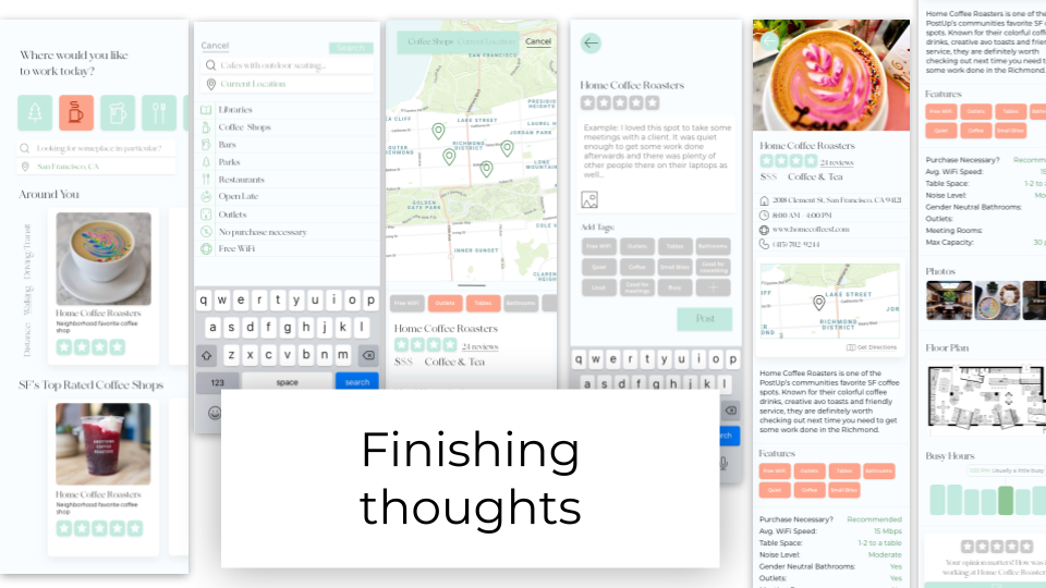
I loved doing this design sprint and am really happy with the product I developed in such a short amount of time. It taught me to go with my gut, and be confident in your decisions in order to make something magical in such a small time frame. I loved working on something different everyday and would definitely come back to this method whenever I need to prototype and test a product quickly. Again, you can check out the prototype here.
