Introduction
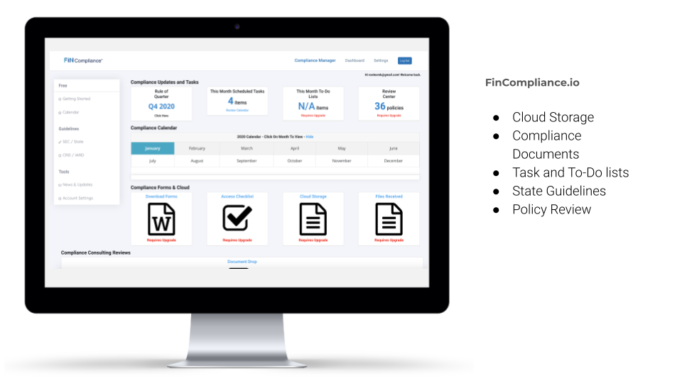
FinCompliance, based in Walnut Creek, CA provides a consortium of compliance services. In addition to offering RIA/financial services consulting, they are also trying to build a compliance management software, FinCompliance.io. The software offers self-serve compliance reviews, policy and procedures and task management tools to registered investment advisors (RIAs).
We were brought on board because they weren’t seeing the engagement or usage of the software that they wanted and our job was to figure why that was happening, diagnose any usability, interaction and design problems and provide potential solutions and recommendations for the firm to develop.
My Role
I was one of three UX designers and researchers working on this project. I working with FinCompliance the fall and winter of 2020. The three of us, Sarah Rastgari, Rick McDaniel and I worked as a team to define our problems, synthesize our research and come up with recommendations and our main deliverables: the three most problematic areas that would max out their ROI (get it? Okay, lame joke I know), usability speaking. I conducted and completed the heuristic analysis on my own and provided in detail examples of what was going wrong and what was going right on their software according to UX industry standards. I also facilitated regular meetings with the UX team to make sure we were on track and everyone had a clear understanding of the problems at hand as they arose. You can view my complete analysis here: Heuristic Analysis
PROBLEM
The FinCompliance problem we were solving was figuring out how we could improve the likelihood of ongoing usage of the platform and what onboarding solutions could be provided for a better user experience on the FinCompliance platform.
Solution
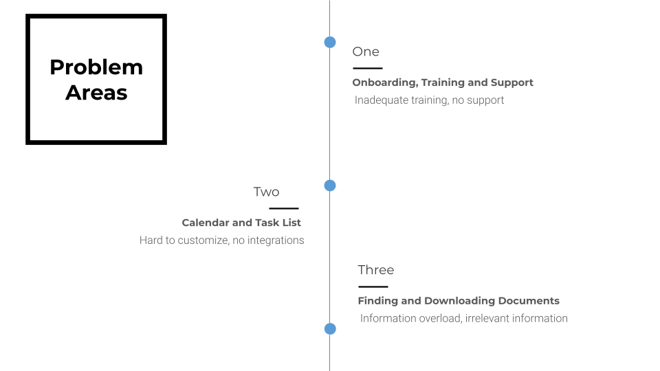
Onboarding, Training & Support: It is imperative for proper onboarding training and support for users to understand and use the software. We found users do not know how to use the software and do not feel confident in what they are doing with the platform through our research.
Calendar, Checklist & Tasklist: Setting should have a customized calendar option so each firm company can have a specific checklist to do. This calendar should integrate with every day checklist and task to do of their regular calendar
Finding & Downloading: Currently, users are met with information overload and have to sort through irrelevant documents and links to find the files more appropriate for them and their businesses. Removing irrelevant information by personalized what documents a user is presented with would remove strain, frustration and confusion on the user and also help FinCompliance do less IT help and consulting on the software.
By addressing these three problem areas with our recommended solutions, FinCompliance would have their business goals met of doing less consulting and increasing usability of the platform, and the user’s would find the software more valuable and easier to use.
Discovery
Finding myself working in an industry I knew nothing about, it was time to sink or swim. Scared as I was facing concepts, legal terms and phrases I had never heard about, I knew I had to get acclimated to the industry and who would use these products and FAST. So I dove right in and started kicking. I started studying the platform, and putting myself in the shoes of the user, even if I didn’t totally understand their exact compliance needs, I could still go through the motions of figuring out how to find out what they were using FinCompliance.io. Looking at FinCompliance’s competitors whose software has been around a little longer and understanding what they were and weren’t doing well was also immensely helpful.
Competitive Analysis
My colleague Rick, conducted the formal competitive analysis but to help provide context around the industry and what kind of product we were working on, I will provide our main insights. You can view his full report here: Competitive Analysis
We wanted to gather insights into their competitors’ features, flows, and feelings evoked by your competitors’ design solutions. By understanding these insights, we could strategically design a solution to make a superior product and experience.
We focused on three competitors that provide compliance and business management software solutions that support boutique investment advisors in completing its regulatory filings, audit preparations, and business tasks.
We chose to evaluate these three companies RIA In A Box, Smart RIA, and NRS. All three of these companies provide compliance management solutions with web-based tools.
One opportunity for improvement based on the competitive analysis for FinCompliance was to refresh its minimalistic visual design approach with a focus on how all the information and software features are organised.
For onboarding, Fin Compliance needed to be implementing a dedicated user flow to onboard new users. This would help its users understand the platform, which would expand ongoing usage. Providing a mixture of content and methods for ongoing training and support is imperative to the platform's success.
In regards to features of the software, FinCompliance would benefit its users by centering on making the Calendar feature one of its main (Red Route) user flow for its users.
Heuristic Analysis
Although it was great to know what FinCompliance’s competitors were up to, we really needed to analyze what was going on in the software and get inside the user’s heads as they used it.
In order to help FinCompliance.io improve the usability of their software, we conducted a heuristic evaluation to find the most pressing UX and UI problems and prioritize what should be addressed first for the greatest improvement in their user’s experience.
We conducted tasks new and existing users might perform to evaluate the site based on Jakob Nielsen’s Usability Heuristics. We created an account, downloaded files, uploaded to the cloud, chatted with an advisor, and created a calendar and a checklist for ourselves. Although the FinCompliance software conforms to Nielsen’s heuristics in several areas, overall the site is difficult to understand and receive adequate training on when attempting basic tasks.
Our goal for the heuristic evaluation was to identify areas in which users may face problems while completing basic tasks on the site as to help FinCompliance find and address these problems to increase usability of their product.
By assessing FinCompliance with Nielsen’s heuristics and completing user tasks, we were able to come up with dozens of problems to address in our recommendations. You can view my complete 13 page analysis here: Heuristic Analysis
FinCompliance adheres to Nielsen’s heuristics as highlighted below.
Control Features - User's can exit the software at any time
Language Standards - Language used in the Fin Compliance Software matches terms, phrases, and concepts that users use in their day to day environments
Consistency - Concepts, words, standards mean the same thing throughout the platform
FinCompliance contains several major and several minor issues that interfere with the user’s ability to be successful using this software.
Minimal Feedback - Software does not keep users informed on their progress through constructive, appropriate and timely feedback. (i.e "You have 3 more checklists to go through this month to be on track for X goal.")
Control Features - No undo/redo options. No "cancel" or incomplete goal messages.
Search - Advanced Search is a huge opportunity for increased usability and is expected by users in platforms similar to FinCompliance.
Symbols - Symbols in FinCompliance are missing corresponding labels, meaning user's will be confused by their meaning if the symbols aren't universally recognizable.
Hard To Use for Novice Users - Software does not cater to different levels of users from novice to experts. No shortcuts or accelerations for frequent/literate users and no reminders/training/"What's this?" for novice/infrequent users.
Design Inconsistency - Some design inconsistency i.e. too many different font weights and sizes, misconstrues the meaning when not used deliberately. Harm's the professional look of the software.
No Empty States - No or very little "empty state design", could be a big opportunity for improved user experience for the software.
Help Features - No FAQ sections or help sections
I recommended they focus on advanced search function, onboarding and training for new users, system feedback, and information architecture. The highest priority usability problems are the software is missing an advanced search function, there is minimal onboarding and training for new users, there is no system feedback and finally, user’s have to sift through information that doesn’t apply to them to find what they need for their personal compliance needs. Empty State designs, streamlined visual design, labels and a chat function were all second priority to those previously stated.
Enough about what we thought could change, it was time to talk to the users and really understand what their experience was using the software.
User Research
These questions were strategically framed to try and understand exactly how the user is currently benefiting from the software, what the key features are from the user’s point of view, and how the software could better serve its intended users. From our surveys and user interviews we wanted to know:
How often they use the platform
How long they’ve been using the platform
Likes and Dislikes of the the software
How they felt about the current training and onboarding experience
What they would like to see in the future for training and help sections
How often they upload and download files
How often they use the calendar and task list
What would get them to use FinCompliance more
What would help them be most successful users of the FIN Compliance Software
Survey Insights
What best describes your experience with the FIN Compliance platform?
66.7% I’ve tried using the training resources on the FIN Compliance platform but still don’t understand the FinCompliance platform.
33.3% I don’t know how to complete my tasks and need more training with the FIN Compliance platform but don’t know how to get the help I need.
Survey Results:
66.7% of users found it hard to search for their files
98% of users thought there was a lack of training on how to use the program
66.7% of users answered “I’m unsure where I am when using the platform”
33.3% of users have trouble finding the forms they were looking for on the program
66.7% of users would prefer Personal and/or group online training sessions
98% of users would prefer Training videos
66.7% of users answered”I choose not to upload documents due to the platform being too confusing”
33.3% of users answered
“I’m confused about where I need to go to upload the documents to the platform.”
User Interviews
We conducted interviews with clients of FinCompliance virtually due to the COVID 19 pandemic. You can view our interview script in its entirety here: User Interview Script
The most important thing to me is the compliance calendar and having a specific checklist to do with my own firm, not national have to do each month. I need a custom calendar, to do list, and task checklist ( more customized)
“The only thing I am using is the calendar. I need to know what I am supposed to do and how I am supposed to do it.”
“It would be cool if I could integrate it with my regular calendar so I look at one calendar every morning and see all my phone calls, meetings..etc. (Collaboration all calendar)”
“And over and over again, users said they didn’t know what to look for and where.”
“To help synthetize our findings, we gathered everything we learned from our surveys and interviews and put them into an affinity map. “
With all of this information, we needed to clearly define how we could best help this product to suit both the business and the users needs.
DEFINE
Clearly articulating the problem we are trying to solve is an integral part of making sure that the design team is in alignment. At the core, problem statements help us make sure that we know what the problem is that we are trying to design a solution for. We do this by framing the problem statement into “How might we…” questions. We turn those challenges into opportunities for design. A properly framed How Might We doesn’t suggest a particular solution, but gives us the perfect frame for innovative thinking. How Might We Statements
“HOW MIGHT WE…” STATEMENTS
provide support resources that easily and quickly solve platform issues and/or users’ questions?
change the calendar to better suit the users’ needs?
create confidence and trust that the users’ are completing the right compliance tasks?
help the users find the right document when needed?
better onboard new users to increase ongoing usage of the software?
Recommendations
Having a clear grasp of the user’s needs, the problems and constraints of the software, we could create a path forward for FinCompliance. We focused on three problem areas:
Onboarding, Training and Support
Calendar, Checklist and Tasklist
and Finding and Downloading Documents.
You can view our complete overview of our recommendations here: Recommendations
Design
Onboarding, Training and Support
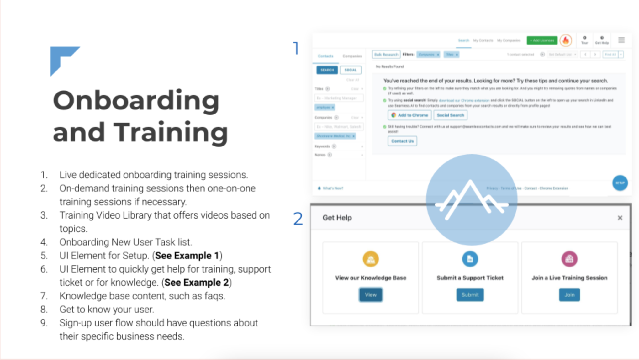
It is imperative for proper onboarding training and support for users to understand and use the software. We found users do not know how to use the software and do not feel confident in what they are doing with the platform through our research.
To build confidence, trust, and ongoing usage of the software, we recommended the following solutions:
Live dedicated onboarding training sessions.
On-demand training sessions then one-on-one training sessions if necessary.
Training Video Library that offers videos based on topics.
Onboarding New User Task list.
UI Element for Setup.
UI Element to quickly get help for training, support ticket or for knowledge.
Knowledge base content, such as faqs.
Get to know your user.
Sign-up user flow should have questions about their specific business needs.
Calendar, Checklist and Tasklist
The calendar should integrate the FIN Compliance checklists or to-do tasks with users' third-party calendars such as google calendar, outlook, etc.
Have an option where the user can get an overview for any specific month on the calendar to know what is required based on the users’ registration type.
A notification UI element (Complete, In-Progress, Need To Complete) within the calendar/task-list feature.
Reminder task list notifications on what needs to be completed for the user.
Finding and downloading documents
The ability to download compliance files and upload files to the cloud are a few of the key features that make FinCompliance what it is. Access to these files is so important to the users and the ability to find and download the correct file is imperative to the success of the product. Currently, users are met with information overload and have to sort through irrelevant documents and links to find the files more appropriate for them and their businesses. Removing irrelevant information by personalizing what documents a user is presented with would remove strain, frustration and confusion on the user and also help FinCompliance do less IT help and consulting on the software.
Personalized Profile that populates relevant document
Filter by State, set of guidelines, size applicable, etc.
Remember frequently accessed documents
Allow to Favorite or Star documents
Search Feature to help users find what they’re looking for
More About sections for every page that allows user to download a file from
Finishing Thoughts
Due to the time constraints and nature of this project, we weren’t able to start implementing any of our design or interaction solutions. I would have loved to keep working on this software and address not only their key usability problems but work on their visual design as well as designing an experience that is easy and joyful to use. I am proud of the work and research we did and believe what we have found to be invaluable to the success of their product. When we came into FinCompliance, the software was operating solely on the needs of the business, and working on this taught me just how crucial a user’s perspective and a user’s needs are to the success of a product. I knew this going into UX, but this project was really a lesson of what happens when you leave them out and I will carry that with me forever.


